I’ve read a lot of posts on The Fountain Pen Network and His Nibs’ blog bemoaning the demise of cursive handwriting, and the state of penmanship in general (especially among the younger crowd). Apparently the teaching of cursive is being scaled back or eliminated in U.S. schools (I’m not sure what’s happening here in Canada).
I’m a connoisseur of fine fountain pens (fine fountain pens, not expensive ones with a white snowflake on the cap), and I enjoy writing with them (otherwise why bother collecting them). Even at work, I use a fountain pen to keep a record of what I do in a notebook. So, you’d think that I too would be alarmed by the demise of cursive. Well, you’d be wrong. “Good riddance”, I say.
First, I don’t think the demise of cursive is related to the general state of penmanship. Rather, I think that the increasing use of computers (via the keyboard) is the main culprit there. Furthermore, I sometimes think that in the not-so-young generation (i.e., mine), cursive is part of the cause of bad penmanship.
When I first started learning to write, it was with a pencil, and the form of writing was called “manuscript” or “block printing”. All letters were made up of straight lines and circles, and we were taught to lift the pencil off the page between each part of each letter. Block printing corresponds most closely to the text one sees in a book or reads on a computer screen, although there are some differences (most notably the letters “a” and “g” in many fonts).

Manuscript printing as I was taught. This example is actually of the "Coming Soon" font by Open Window, from Google Fonts.
The problem with block printing is that it’s slow. All those pencil (or pen) lifts take time. When we were taught “joined writing” or “cursive”, we were shown new forms of the letters that were designed to be interconnected without having to lift the writing implement off the paper. But there are two problems with the cursive writing we were taught, one of which is immediately obvious to every school child:
- The new letter forms often don’t even remotely resemble the handwritten manuscript form, or the form we see in books.
- The new forms have so many extra swoops and curls that they take longer to write, even when you factor in the time saved by not lifting the pen.

The form of cursive that I was taught (letters shown separated for clarity). From "The Palmer Method of Business Writing", 1901.
In short, traditional cursive, even when written beautifully, contributes neither to speed nor legibility. Yes, it is almost as legible as block printing once you’re used to it, but only if it’s the same form you were taught. My mother has beautiful cursive writing, but I can barely read it; she was taught in Germany, where they use different cursive letter forms than we are taught in North America.
So what happens when we grow up and enter the real world? Many (but not all) of us revert to block printing, with some aspects of cursive writing thrown in. The result is handwriting that varies greatly in legibility, but can be produced quickly. Such writing is inconsistent between writers, and often even inconsistent within itself. Here’s an example of my current handwriting:
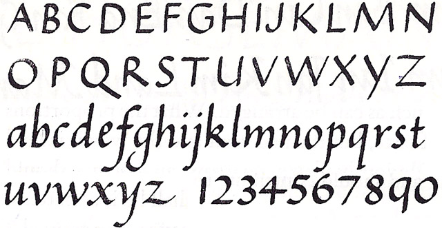
I recently discovered Italic handwriting. Note that this is not the same thing as calligraphy, unless done exceptionally beautifully and slowly. It is an everyday handwriting used by many since the Renaissance, before cursive as we know it was invented.
Like block printing, Italic printing is made up of simple shapes, in this case, ovals and straight strokes. It is usually written at a slight angle, but the principles can be applied upright as well.
Italic is as easy to teach as manuscript, since the basic principles are equally simple, and the motions are more rhythmic and natural. Italic printing also looks much like manuscript, and is very similar to the italic characters encountered in books and on web pages.
Once the student has mastered Italic printing, Italic cursive is an easy next step. The rules for Italic cursive are basically:
- Write the letters the same as you would for Italic printing.
- Join them up when it is convenient and unambiguous.
In other words, people who are taught Italic printing will discover Italic cursive on their own, as the need for speed takes over. The advantage over this happening to manuscript is that the Italic letters naturally lend themselves to this, and the result will still be legible.


